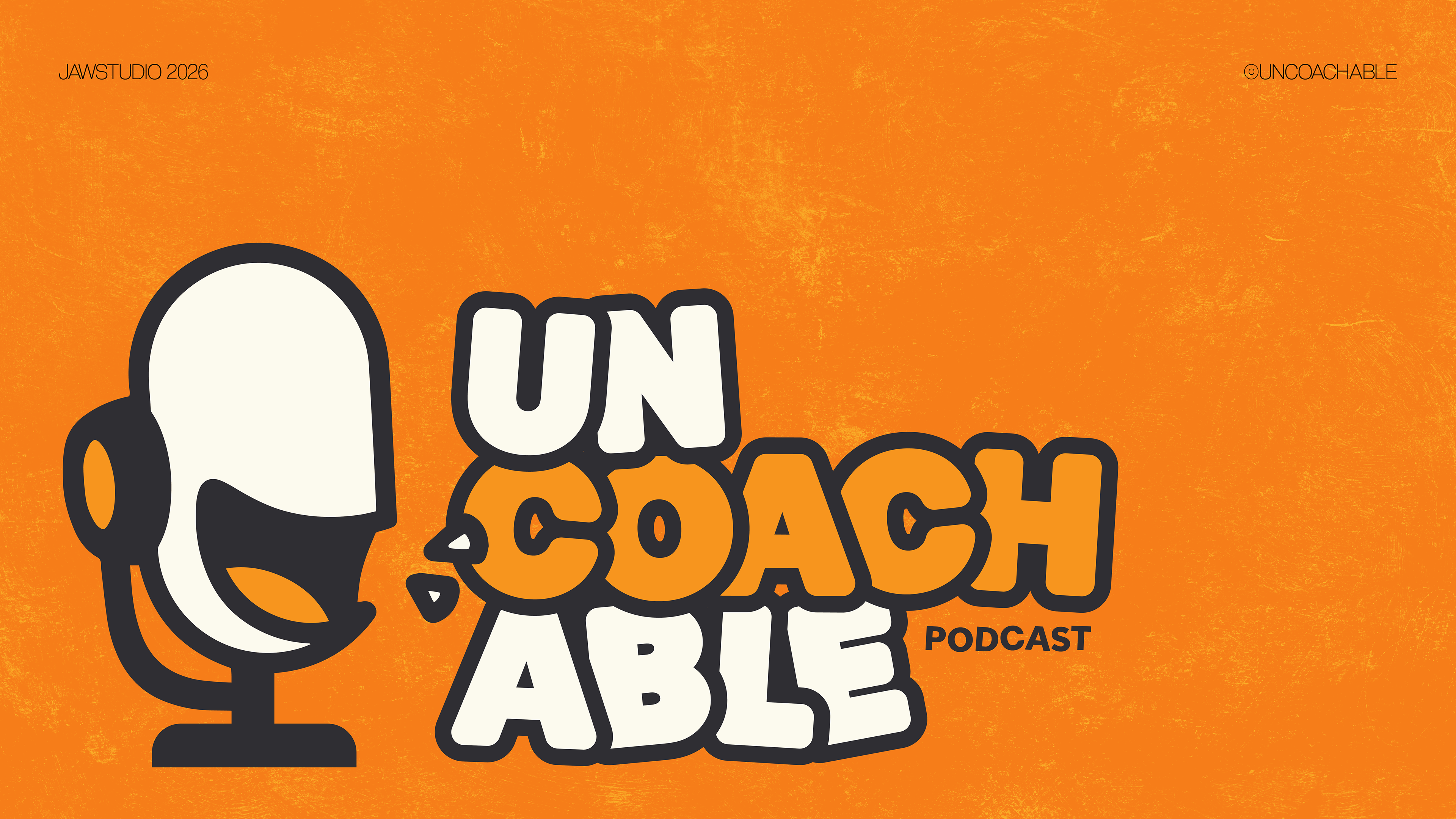
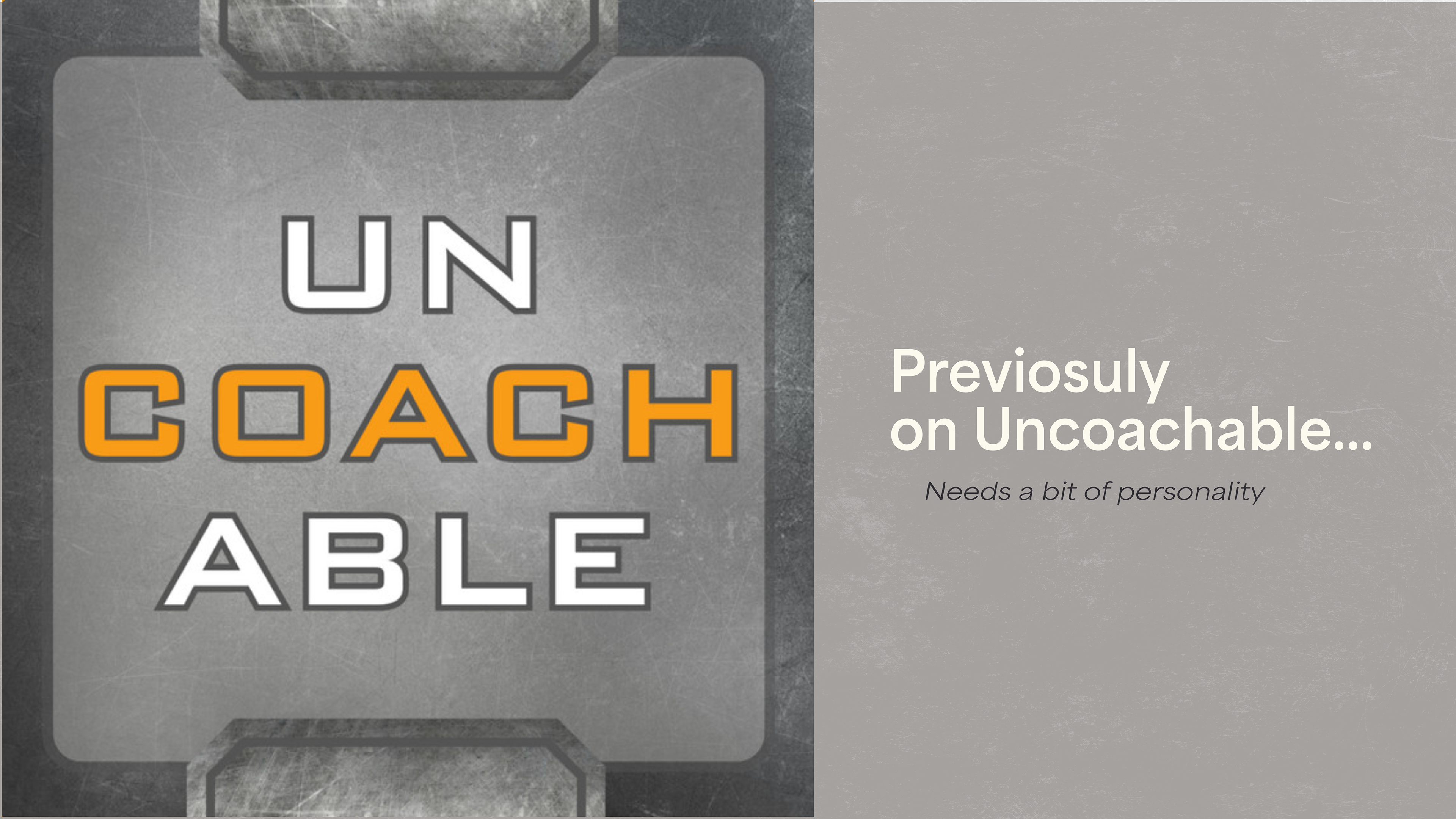
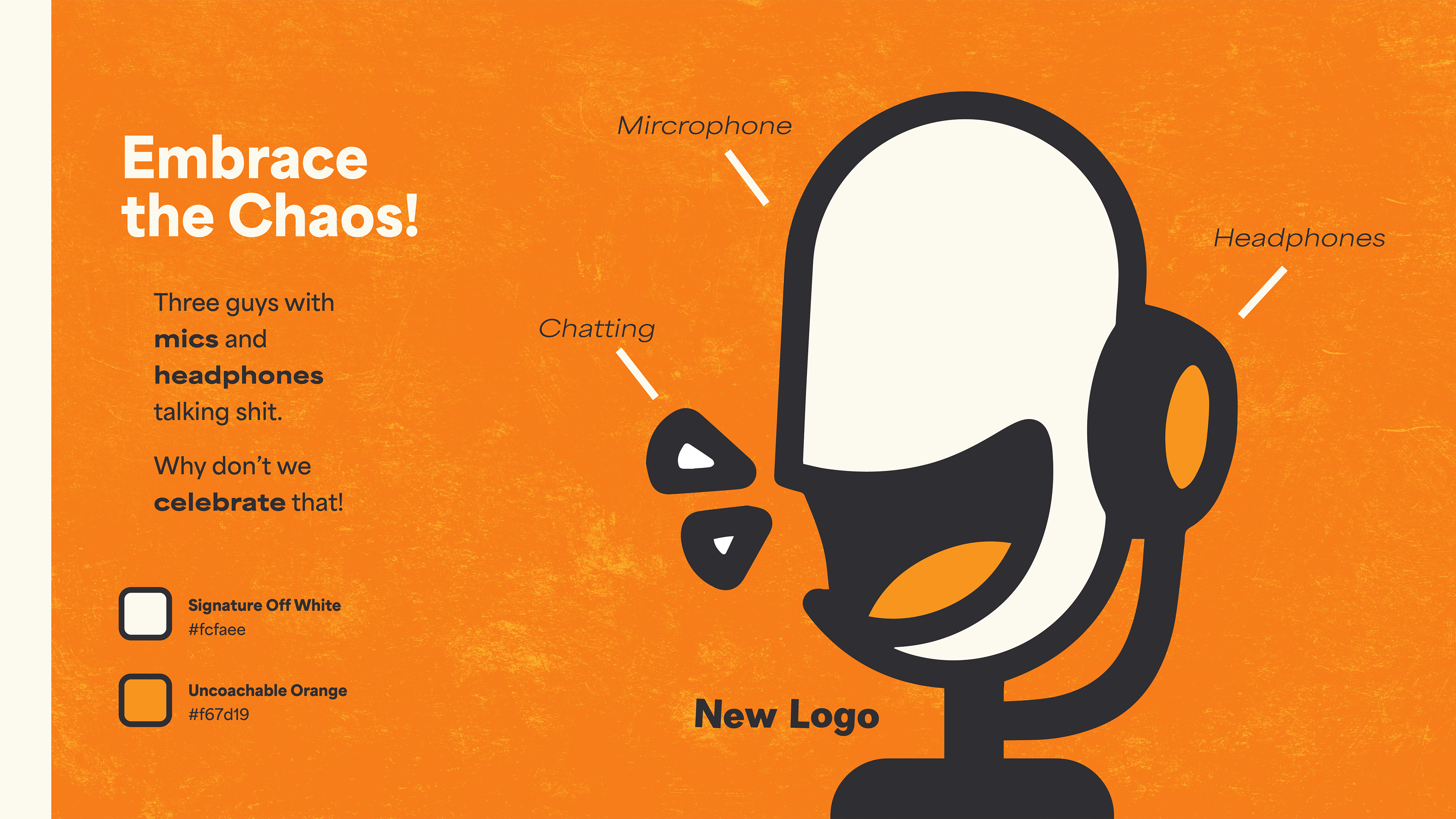
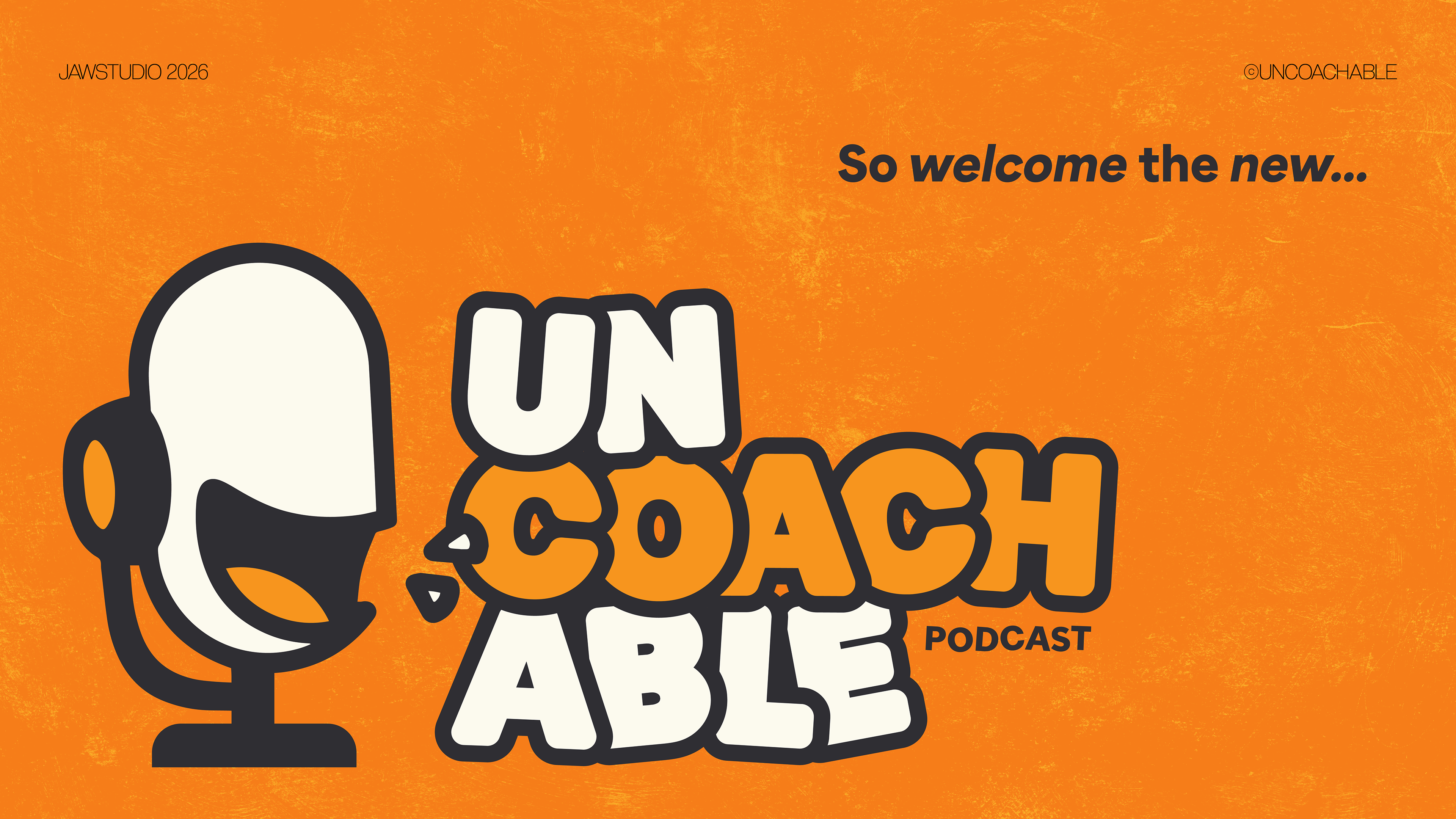
Focused on telling it like it is, this program is bold and brash. The goal of this rebrand was to imbue the branding with the personality that the show embodies.
To enforce this, I focused on exploring a bold direction, utilizing the existing orange as the new primary colour, and reusing the rough textures in an eye-catching way. This also included creating custom typography to complement the newly designed logo mark.
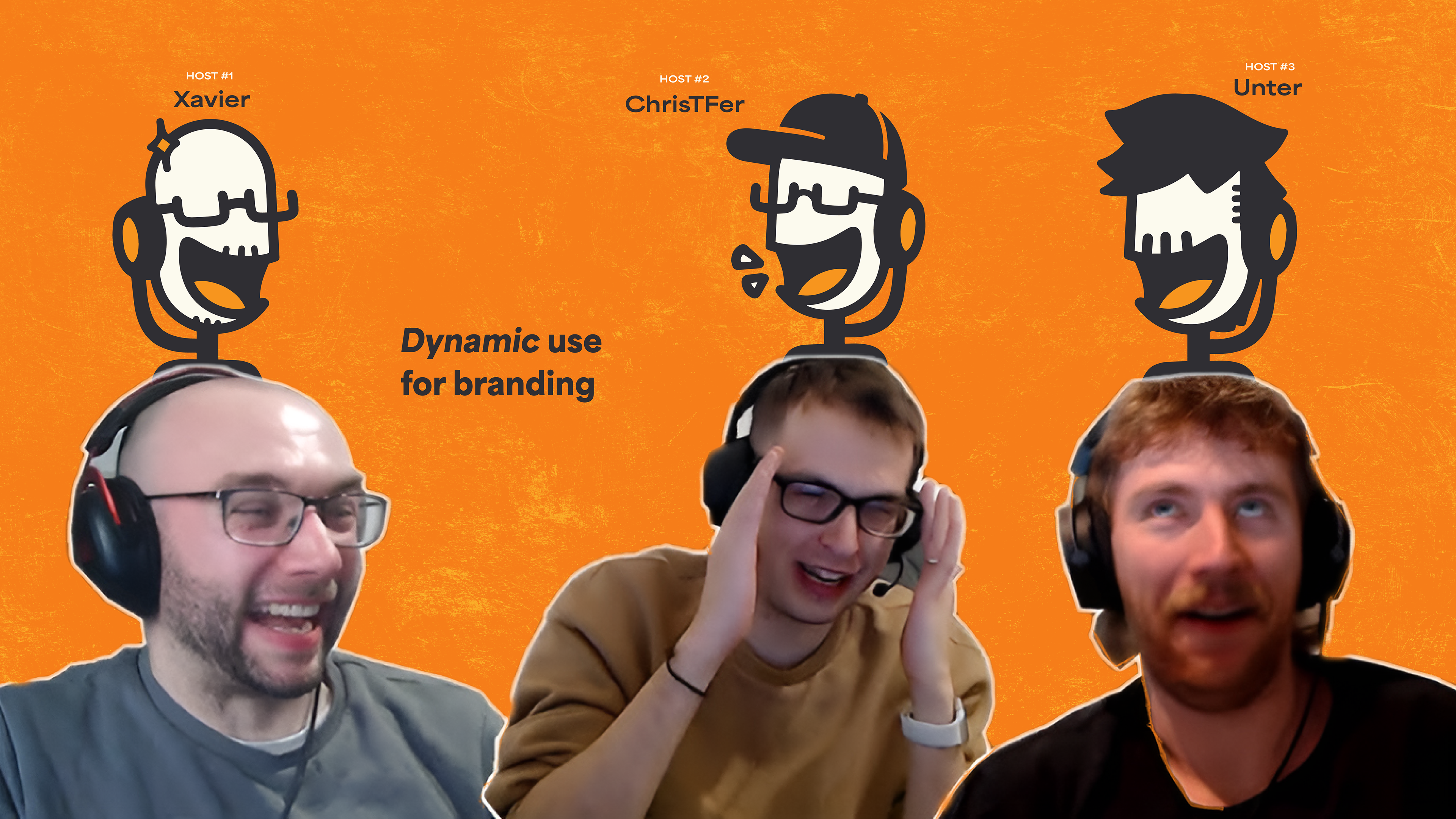
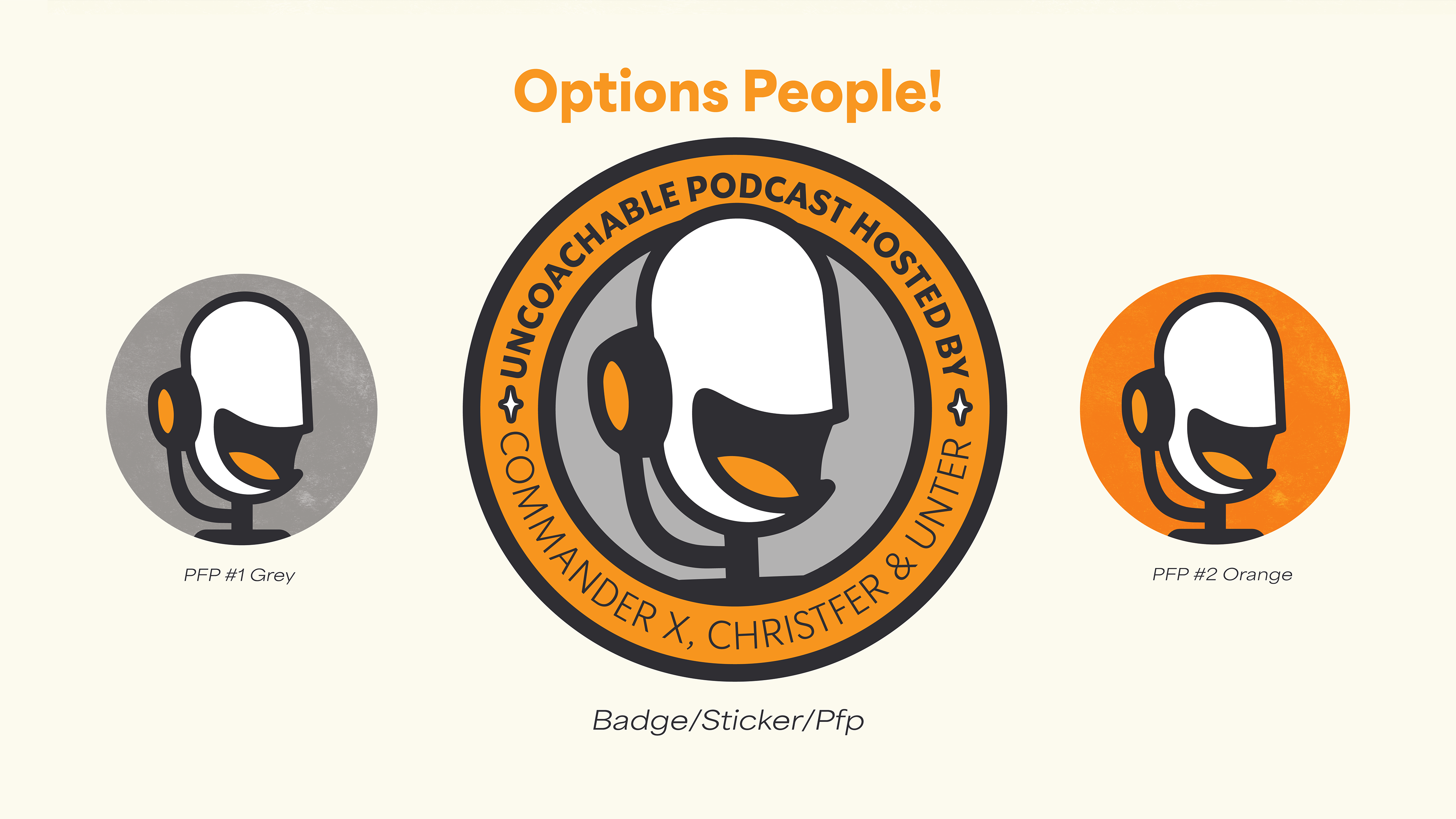
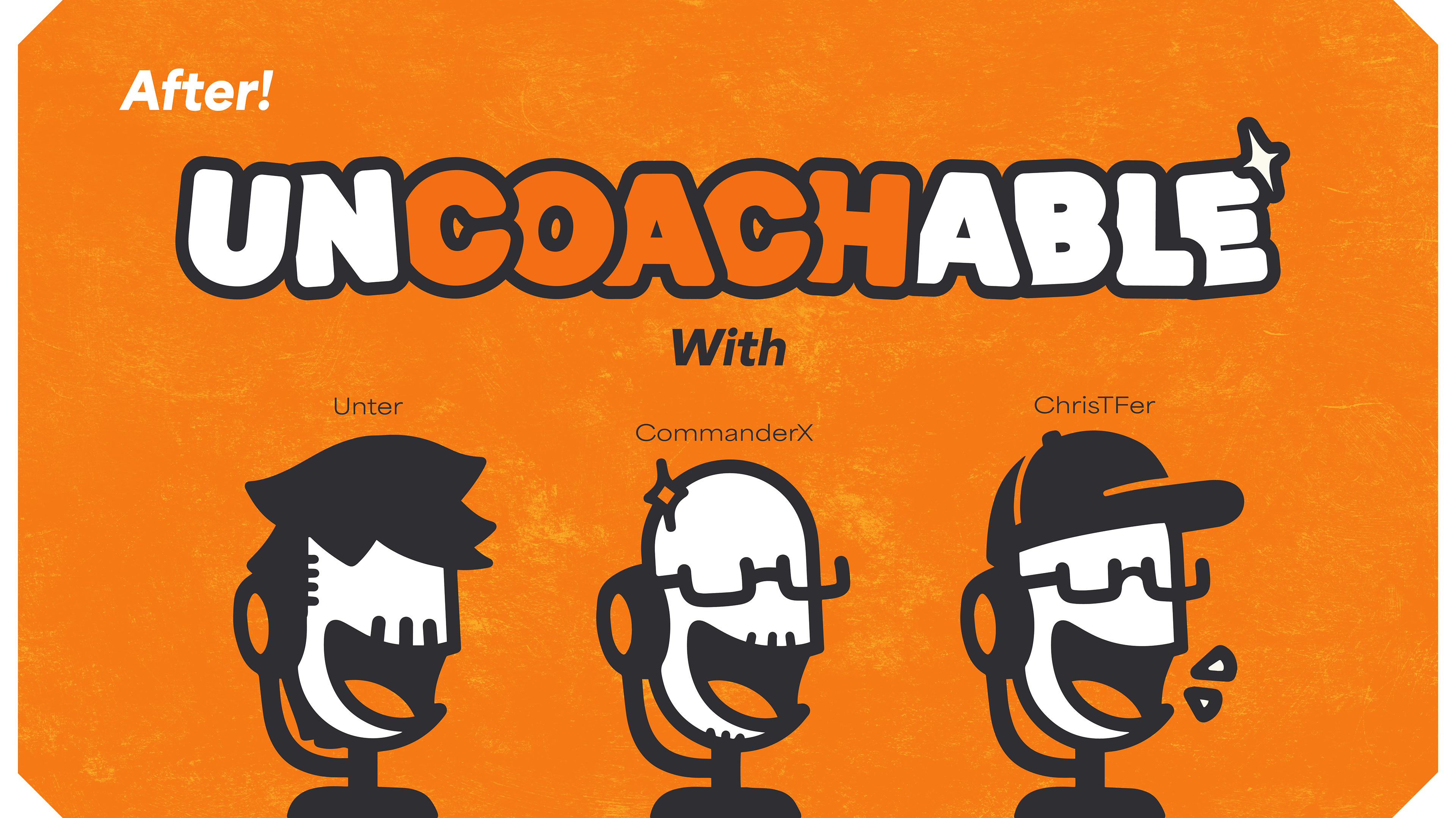
The new logo's flexibility not only implies a microphone, headphones, and chatting, but can be modified to dawn the appearance of each host.